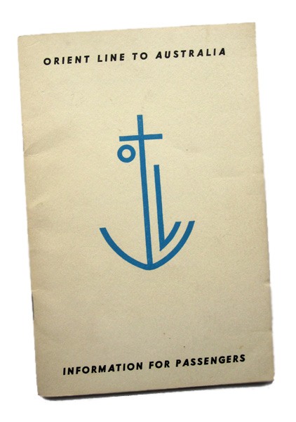
It is no secret I like a bit of anthropomorphism. Put a face on it and I’ll probably like it. I wouldn’t really have expected an anchor to get this sort of face lift though.
This Orient line brochure makes the most of Edward McKnight Kauffer’s lovely smiling Orient Line logo. Kauffer was probably introduced to Orient Line work via his partner Marion Dorn, whose carpets graced the floors of the ship Orion in 1935. The anchor logo is hard to date though. Certainly it was all over Orient Line paperwork in the 1950s but looks earlier than that, design-wise.
Kauffer was one of an elite band of renaissance commercial artists of the first half of the twentieth century. He designed book covers and illustrations, posters, adverts, fabric bale labels. Indeed anything that stayed still long enough for him to illustrate it. He did lots of work for London Transport too, the graphic gig of that century.
Despite nice logos and leaflets, cruises have never really appealed to me. Travelling by boat, yes. Formally organised leisure time, no. This handbook describes the services available on board ship on the way to Australia, via the Suez Canal.
The trip took 25 days, one way. That’s a lot of sun and shuffleboard. And a lot of time to admire a logo.

You write so beautifully about someone I really admire. Thank you so much for your Kauffer posts.
Thanks for that, very nice to hear.