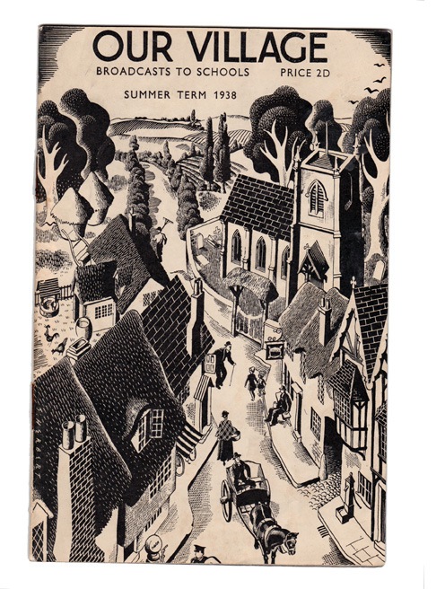
It is London Design Festival. So. Is Shelf Appeal celebrating with yet another picture of another shiny chair, very subtly altered from all the other shiny chairs out there? No indeed. We’re back in 1938 with the visual equivalent of a cream tea.
I have posted about these BBC booklets before as I think they are lovely things. Illustrative, nicely laid-out, nice typography. And such great examples of the BBC ‘voice’ of the period. You might argue that voice is long gone. Graphically it certainly has.
Well, this booklet gave me the usual opportunity for digging around the internet for information on the artist. There is a signature ‘S Herbert” down the left side of the illustration, who seems to be Stanley Herbert. I found some super scraperboard illustrations here and 3 rather accomplished London Transport posters here (apologies in advance to Quad Royal if that tickles their fancy). Interestingly Herbert taught poster design at The Reimann School (the London mini-me Bauhaus, almost) alongside McKnight Kauffer. He also illustrated Puffin Picture Book 99: The Story of a Thread of Cotton and at least one GPO telegram. There doesn’t seem to be an awful lot else to find out about him, which is a shame.
This cover is almost certainly a scraperboard illustration. Wikipedia tells us scraperboard illustrations are made by etching into a thin layer of white China clay that is coated with black India ink. Tasty enough to make you take up tools, I’d say. It seems you could work on white scraperboard as well. But I’m not qualified to make out which was used here.
I like Stanley Herbert’s work. It’s proper commercial. Not as swish and arty as some of his better known contemporaries. But full of detail, craftsmanship and quiet English wit.

Very fine. I think we might have the Puffin Story of Cotton somewhere (to be specific, in the giant pile of Puffin Picture Books on Mr Crownfolio’s office shelves) so I will try and dig this out.
I do like his giant LT cow’s head too, and have rather coveted that for a while (we have two other Smithfield posters that size, and the wall is rather asking for a third!)
But there is also synchronicity in the air, as I had two Schools Booklets in my inbox this morning, the other on Serge and Tweed (http://sergeandtweed.blogspot.com/). It must be that start of term feeling.
Yes, it is the start of term, I forgot. I have some of those BBC singing booklets too. So much paper tat, so little time to blog.
I think I should change the strapline of Quad Royal to your last sentence…
[…] 1938 BBC leaflet design, posted by Shelf Appeal, reminds me of the BBC’s 1980’s Miss Marple title […]
Looks more like pen and ink to me; the roofs probably areas of black india ink, then worked over with white india ink. But I’d need to see the original to be certain. Fab piece of work either way. The days when the BBC ran educational programmes during the afternoon eh?
All those lovely BBC handbooks and booklets – I recently put this Barbara Jones item on Flickr
http://www.flickr.com/photos/36844288@N00/5380252749/
amongst a few others
http://www.flickr.com/photos/36844288@N00/sets/72157623313797504/with/5380252749/
I got one of the Barbara Jones booklet too, recently. The illustrations are very happy. Great stuff. You have some great stuff indeed on Flickr.
I have started a Wikipedia article about Stanley Herbert, and another about the Reimann School.