My happy charity shop purchase of a book on the history of Sainsbury’s has added extra weight to the shelves. I have any number of these social histories of shops, usually cumbersome and cheaply designed on some nasty desk top publishing software. Often produced to celebrate centenaries or as gifts to staff – how they must love that – these books make up the majority of literature on shops and shopping.
Still, they often have some lovely images drawn from archives (if the shop is lucky enough to have one) or found behind desks, in cupboards or contributed by retired staff. The Sainsbury’s book is written by their archivist and is one of the better ones, with lots of interesting anecdotes and research in it.
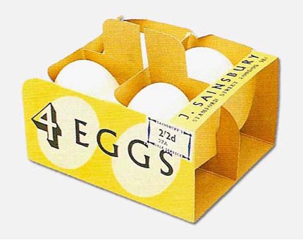
And. OK. I mainly bought it on the strength of this picture of a box for eggs. So fine and beautiful a package, it makes you want to buy those eggs, whether you need them or not.
The book tells us the box was designed by Leonard Beaumont, who was employed as a design consultant to Sainsbury’s in 1950 and remained there until 1964, ratifying the ‘own’ brand produce. The Vads website (a reprint of a 1969 Design magazine article, with more nice packaging to see) suggests Beaumont was brought in to handle ‘the conversion from counter shops to self-service’. His standardised typefaces and sharp packaging would have been ideal for a customer new to finding their own produce on shelves. Beaumont was fond, apparently, of the Monotype Albertus typeface, as seen on the eggs box. But he re-drew the ‘j’ as it was a little weak. Not great when the company still traded as J Sainsbury.
I still think some of the best contemporary packaging designs come out of own-brand lines. Tesco Basics look brilliant to me. Free of the italics, colours and tastefulness of, say, their ugly Finest range. They fairly zing on the shelves. Waitrose own brand designs are great, too, particularly the Pure cosmetics that trump many a product design in SpaceNK.

How cool would this be filled with chocolate eggs for easter!
Can you please tell me the name and the author of the book via mail?
Thank you
Silvio
Hello, the book is “The best butter in the world: A history of Sainsbury’s” (ISBN: 9780091821371) by B. R Williams
[…] I was especially excited about her examples of different sorts of packaging, including this beautiful 1950s egg box from Sainsbury’s. It gets me thinking about packaging. Remember when the bag-in-the-box which cornflakes came was […]