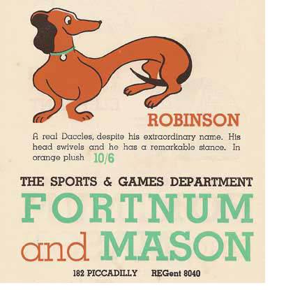
Shops and their signature colours. Lovely. Harrod’s green. Selfridge’s yellow. Liberty purple. Fortnum & Mason’s eau de nil.
I’m not sure when Fortnum and Mason adopted their tasteful, delicate blue-green choice. It’s a colour that shimmered on walls and shot through the weave of ladies striped gowns in the Georgian period. As Fortnum has been trading, in some form or another, since then, it is nice to think of it having been their signature colour for a long time.
But it is more likely that the colour became theirs in the 1930s, when it was revived and took on an iconic status. Everything from Vitrolite bathrooms to crushed velvet, bias cut evening jackets, came in eau de nil. Back then, the words ‘eau de nil’ were all that was tasteful.
Fortnum’s have recently revived the colour. They have rebranded and reboxed everything from biscuits and cup cakes to tea in it. The façade of the shop too proclaims its allegiance; looking somewhat like a grand cake on the busy, dirty length of Piccadilly. And Fortnum’s have liberally applied the colour to their new shops-within a-shop in Japan, which repeat the décor of the London store.
The wee hound pictured here is from a Fortnum and Mason marketing leaflet of the 1930s. And although he was available in ‘orange plush’, the eau de nil of the Fortnum lettering is the thing.

Leave a Reply