Cooking is not so big here at Shelf Appeal. The accoutrements of cooking, on the other hand, often make it on to the shelf. Tea towels, of course. Packaging, naturally. One or two cook books illustrated by Edward Bawden, essential. Yet this blog started off with a cookbook post, all about the look of the thing, back in 2007.
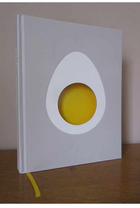
Weidenfeld & Nicolson is an imprint under the Orion publishing hat. It isn’t one on my design radar as they don’t have a particular look and feel to their output. I’m so visually-led that I notice logos (the Faber ff) or colours (Penguin) and remember a publisher from signifiers like that. Yet their extremely pick-up-able cover for Egg by Blanche Vaughan designed by Clare Skeats can’t be faulted. Super simple and satisfying. Like an egg, in fact.
I do really like a book with a one word title. The word egg is a very nice looking word, with lovely letters to play with. But this cover has no egg (text) on it. It is formed simply by a white egg silhouette with a cardboard cut out of an egg yolk, filled from behind by the yellow title page. All on a tasteful grey ground.
The book opens to nicely laid out recipes such as pink pickled eggs and gypsy toast. Illustrated with lovely egg and lifestyle photographs. I may even be persuaded to actually cook something eggy now.

Leave a Reply