 Coffee, there is nothing better. But, well, perhaps a nice bit of coffee ephemera comes close.
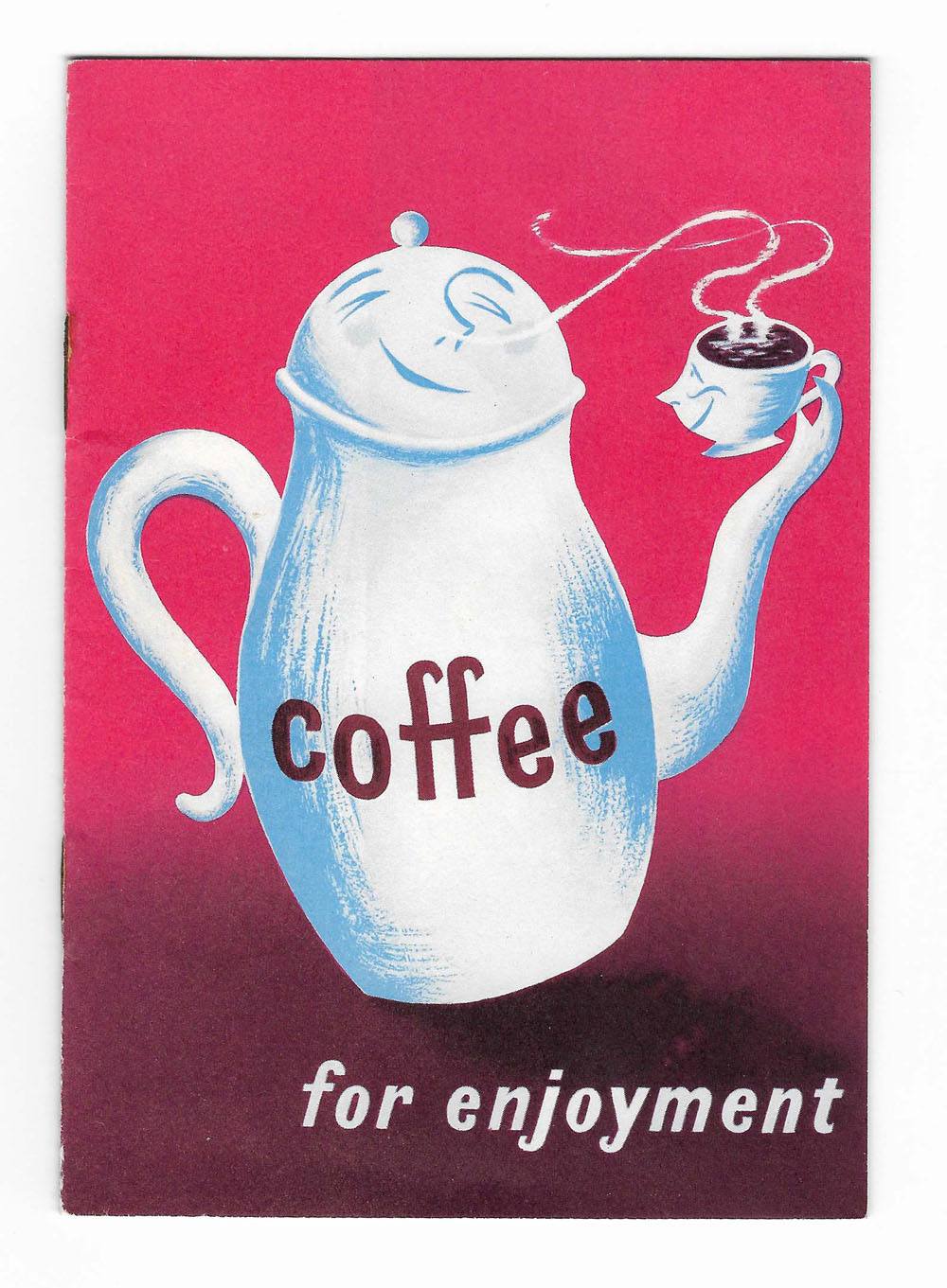
This promotional leaflet Coffee for Enjoyment was issued by The Coffee Publicity Association Ltd in 1956. The cover was designed by Stan Krol. He studied at Dundee School of Art after being invalided out of the army at age 35 in 1945. Moving to London he got work early on with the GPO. The rest, as someone (probably me) says, is mid-century commercial designer history. There is more of his work here.
Krol’s coffee pot reminds me of a Disney animation character, especially the cup. It’s not a great illustration but the whole effect works. The insides of the booklet are rather more dull and promotional in nature. Lots of National Geographic style photographs of people happily growing coffee beans. But a few pages on how to make good coffee are nice reading, including the good advice to ‘use enough coffee’. That year, 1956, there were apparently nearly 500 coffee bars in London and a further 2000 in the rest of the country. You can only dream of all those Formica tables.
The Coffee Publicity Association Ltd doesn’t wield much information for the Googler. They published something called the Coffee Trade News and other booklets along similar lines to this one. And at some point changed their name to The Coffee Promotion Council Ltd. Equally catchy.
But apropos to the cover illustration, the booklet ends with words to live by: ‘Whichever method of coffee making you prefer, always serve it hot, and in attractive pots and cups. The finest coffee can lose much of its appeal if the crockery offends the eye.’

Totally agree regarding crockery that offends the eye. The eye sips first.
That’s a nice way to put it.