
I had my beady eye on this book coming out. Paul Nash is an artist and designer I always find draws me in. He was one of a handful of artists that worked in the interwar years and across different mediums. They knew of each other, they studied and worked together. They came to epitomise the idea of a commercial designer, though they may not have chosen that word to describe themselves. And like Paul Nash they earnt their living from commercial work and the applied arts and crafts, rather than fine art. Nash’s approach to the dilemma of working in different artistic spheres was to try to articulate and raise the reputation of the commercial and applied arts closer to that of fine art. He argued there was no distinction between them and, as this book shows, it was an argument he addressed throughout his life and one he never really won.
James King has written another book on Nash, so he is a man a (little) obsessed. This book begins with Nash’s written attempt to articulate the position of the fine and applied arts that was his publication of 1932: Room and Book. King then steps through each chapter looking at a different aspect of Nash’s work, from his bookplates and book illustrations, to his theatre work. From his pattern work on textiles and papers, rugs, ceramics and his interior designs (too brief a chapter for me, this) then back to book illustration. A chapter on his commercial work, including posters, gives way to a look at Nash’s use of photography. The final chapter is a bit of an oddity, looking at Nash’s work in comparison with that of Ben Nicholson’s. Nash comes off the poorer, which seems a rather low note to finish a book on.
Although this book provides a detailed and thorough look at Nash as a designer, I did feel the want of a bit more of Nash the person. There is almost no personal detail here. Nothing much about Nash’s changing personal circumstances that might have reflected on his changing professional output. Of course this is not a biography but a little bit of personal gossip would have been good. Despite that, Nash comes across here as an exacting person, stubborn and passionate about the reproduction of his work. As Oliver Simon said (quoted at the end of the book) Nash was ‘wonderfully particular.’ He seems to have been someone who felt keenly his place in the design world. And who probably worried a bit too much about it all.
The fact that there are two chapters covering Nash’s illustration work suggests King is at his most comfortable when describing Nash’s paper-based work. Being an English teacher, King gives us quite lavish descriptions and quotes – and so great context – for the illustrations. King also seems quite concerned with placing Nash in amongst his artist contemporaries and professional contacts. No designer is an island and it is nice to read about the networks of influence Nash worked amidst. But I think King gives over a few too many of the images to work by other designers. Lovely though they are, it seems an odd use of an image budget. But still, I quibble, because there are lots of images to enjoy. And because there are lots of images, the reading goes quicker. This is quite an easy book to digest in a few sittings.
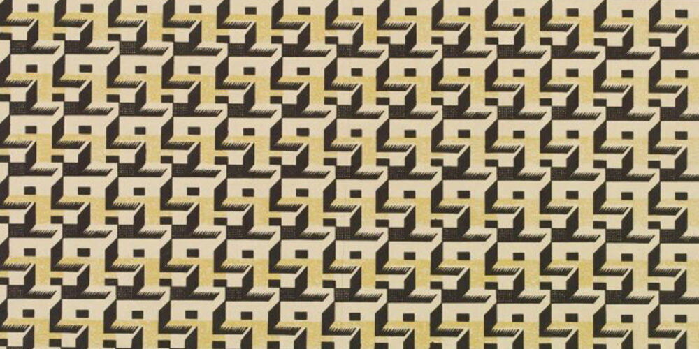
As well as being surprised by the strength of Nash’s theatre designs, which I had not seen before, I was struck by how badly Nash handled text in his designs. He very often fell short of the mark in terms of legibility and comprehension. I can’t help but feel he might have done well to make friends with a grid and a typographer or two. But, all in all, it is just great to see Nash’s design work laid out in this book for our delectation. I first came to Nash’s applied art work through his textile designs. They are loose and a bit sexy, his textiles, in a way he never really achieved in his other design work.
I think Nash would have been pleased that this is a satisfying book to hold. A dust jacket and printing on nice paper always make me feel a lot better as I start to read any book. And I still much prefer my non-fiction books to be real books rather than digital beings. For me, as for Nash, a book is a tangible thing as well as a collection of words and images. Finally, in the spirit of Nash (who, it seems to me, was almost never completely satisfied) I do wish they had seen fit to print the endpapers of this book with one of Nash’s Curwen patterned papers. The plain paper they used is a good Nash colour – a pale khaki. But goodness me, Nash gave very good pattern paper.
Leave a Reply