The allure of a smiling face in a graphic (or on a mug, or pretty much anywhere) never gets tired as far as Shelf Appeal is concerned.
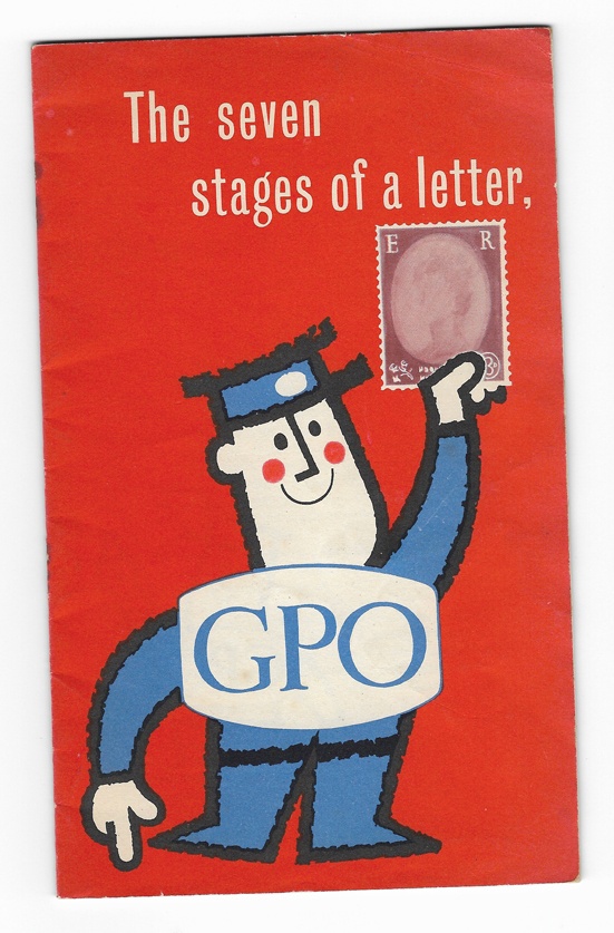
This GPO booklet ‘The seven stages of a letter…or what you get for three pence’ is from 1960 and was designed by Harry Stevens. It is a superlative piece of graphic design, with Steven’s postman stepping through the pages, illustrating the story. And a nice infographic of ‘the journey of a letter’ across the centre spread. The idea was, it seems, to tell the public how they could aid swift delivery and to remind them to: ‘Remember that Clear and Correct Addressing Speeds the Mail’.
The cover is the best bit, though. Bright red and happy; how could you resist picking this booklet up? In fact it had an accompanying poster, exhorting the public, a bit ironically, to pick up the booklet. For sure the lettering looks a bit awkward but you can forgive that because of the punch of the whole.
Stevens is increasingly becoming known for his poster work, as mid-century graphic enthusiasts and poster collectors start putting the word – and his back catalogue – out there. Noticed by the ever vigilant Quad Royal back in 2012, he designed a lot of equally perky-looking graphics for British Rail and London Transport, amongst others.
It’s a puzzle to me, or perhaps not, that a poster by a named designer can and will go for hundreds of pounds, yet the accompanying ephemera costs just a few pounds. Provenance, rarity and size obviously weigh in here. But still; give some love to that ephemera, people.
Leave a Reply